Process Analysis Tools
Process analysis tools are primarily intended for use by business end users looking to document, analyze and streamline complex processes, thereby improving productivity, increasing quality, and becoming more agile and effective. These tools also support the roles of business process architect and business process analyst, and enable them to better understand business processes, events, workflows and data using proven modeling techniques. Flow charts, process maps, Program Evaluation and Review Techniques (PERT), Critical Path Methods, Stem-and-Leaf Plots, Box plots, written procedures, and work instructions are tools used for process analysis and documentation. Other lean techniques such as value stream mapping and spaghetti diagrams are also often used.
Procedures and Work Instruction
There are three terms often confused: Process, Procedure, and Work Instruction.
Process – any activity or set of activities that uses resources to transform inputs into outputs can be considered a process. ISO 9001 has a Process approach
Processes must have defined (but not necessarily measurable) objective(s), input(s), output(s), activities, and resources. You should be able to ask these when defining a process:
- Activities:
- What are the basic jobs carried out in your department?
- Can you explain to me your operations here?
- Inputs/Resources:
- What information do you need to start your work?
- Where does it come from?
- Outputs:
- Who receives the result of your work?
- How do you know if you’ve done your job correctly? (meet objectives)
Procedure – A procedure outlines how to perform a process, such as “Purchasing”:
- Who performs what action
- What sequence they perform the steps in the task
- The criteria (standard) they must meet
Your procedures (along with your ISO 9001 quality manual and required forms) make up your quality management system (QMS). Your procedures will describe how you operate and control your business and meet the ISO 9001 requirements.
Procedures are used for all of the Quality System Processes. You need to have all of the ISO 9001 required Procedures to ensure that the quality management system or QMS runs correctly and consistently.
Work Instructions – A work instruction describes how to perform a task, which is a more detailed portion of the procedure such as “Completing a PO” or “Ordering supplies”. You may need more detail than that described in the procedures. Many businesses include work instructions to aid in training, to reduce mistakes, a point of reference for jobs, etc.
Written Procedures
A procedure is a document that specifies the way to perform an activity. For most operations, a procedure can be created in advance by the appropriate individual(s). Consider the situation where a process exists, but has not been documented. The procedure should be developed by those having responsibility for the process of interest.
As an example, ISO 9001 :2008 states that internal procedures shall control nonconforming product so that it is prevented from inadvertent use or installation. in many companies this a requirement is the responsibility of the quality department, although the actual functions are performed by various other departments. Suppose the results of the interviews revealed the following process to control nonconforming material:
- The nonconformance is discovered.
- The nonconforming material is segregated from conforming material.
- The nonconformance is documented.
- A material reviewboardreviewsthenonconformance to determine disposition. The possible dispositions are:
- Scrap the part, which ends part usage and requires no further action.
- Accept the part for use “as is” or “as repaired.”
- Rework the part to its original configuration requirement.
- The actual disposition is made.
- The product is returned to normal flow.
- The paperwork is cleared.
This example focuses on the internal nonconforming material flow. The process sounds simple in generic description. However, it may take several twists and turns to show what really happens. The flow charting process helps to visualize the necessary actions.

Work Instructions
Procedures describe the process at a general level, while work instructions provide details and a step-by-step sequence of activities. Flow charts may also be used with work instructions to show relationships of process steps. Controlled copies of work instructions are kept in the area where the activities are performed. Some discretion is required in writing work instructions, so that the level of detail included is appropriate for the background experience and skills of the personnel that would typically be using them. Similar to writing procedures, the people that perform the activities described in the work instruction should be involved in writing the work instruction. The wording and terminology should also match that used by the personnel performing the tasks. The following is an example of a work instruction for shipping widgets.
ABC Widgets, Inc.Written By: XXX Approved By: XXX Work Instruction No: XXX SUBJECT: Shipping of widgets by the shipping department. 1. PURPOSE: To describe the actions necessary to ship a customer order 2. SCOPE: Applicable to shipping and warehouse operations 3. PROCEDURE: 3.1. Prepare orders for shipment 3.2. Packaging 3.3. Complete and Ship |
Stem-and-Leaf Plots
The stem and leaf diagram is a convenient, manual method for plotting data sets. These diagrams are effective in displaying both variable and categorical data sets. The diagram consists of grouping the data by class intervals, as stems, and the smaller data increments as leaves. Stern and leaf plots permit data to be read directly, whereas, histograms lose the individual data values as frequencies within class intervals. Stem-and-leaf plots are a method for showing the frequency with which certain classes of values occur. You could make a frequency distribution table or a histogram for the values, or you can use a stem-and-leaf plot and let the numbers themselves to show pretty much the same information.
For instance, suppose you have the following list of values: 12, 13, 21, 27, 33, 34, 35, 37, 40, 40, 41. You could make a frequency distribution table showing how many tens, twenties, thirties, and forties you have:
|
Frequency Class |
Frequency |
| 10 – 19 | 2 |
| 20 – 29 | 2 |
| 30 – 39 | 4 |
| 40 – 49 | 3 |
You could make a histogram, which is a bar-graph showing the number of occurrences, with the classes being numbers in the tens, twenties, thirties, and forties:

The downside of frequency distribution tables and histograms is that, while the frequency of each class is easy to see, the original data points have been lost. You can tell, for instance, that there must have been three listed values that were in the forties, but there is no way to tell from the table or from the histogram what those values might have been.
On the other hand, you could make a stem-and-leaf plot for the same data:

The “stem” is the left-hand column which contains the tens digits. The “leaves” are the lists in the right-hand column, showing all the ones digits for each of the tens, twenties, thirties, and forties. As you can see, the original values can still be determined; you can tell, from that bottom leaf, that the three values in the forties were 40, 40, and 41.
Note that the horizontal leaves in the stem-and-leaf plot correspond to the vertical bars in the histogram, and the leaves have lengths that equal the numbers in the frequency table.
BOX PLOTS
One of the simplest and most useful ways of summarizing data is the boxplot. This technique is credited to John W. Tukey . The box plot is a graphical representation of data that shows a data set’s lowest value, highest value, median value, and the size of the first and third quartile. The box plot is useful in analyzing small data sets that do not lend themselves easily to histograms. Because of the small size of a box plot, it is easy to display and compare several box plots in a small space. A box plot is a good alternative or complement to a histogram and is usually better for showing several simultaneous comparisons. The boxplot is a five number summary of the data. The data median is a line dividing the box. The upper and lower quartiles of the data define the ends of the box. The minimum and maximum data points are drawn as points at the end of lines (whiskers) extending from the box. A simple boxplot is shown in Figure below. Boxplots can be more complex. They can be notched to indicate variability of the median. The notch widths are calculated so that if two median notches do not overlap, the means are different at a 5% significance level. A Boxplots can also have variable widths, proportional to the log-of the sample size. Outliers can also be identified as points (asterisks) more than 1.5 times the ‘interquartile distance from each quartile. Some computer programs can automatically generate boxplots for data analysis.

Steps to create boxplots:
To create a box and whisker plot, just follow these steps:
-
Rank the data measurements in order from least to greatest.
-
Determine the median of the data.
Find the observed value in the rank-ordered data where half of the data lies above and half lies below.
- When the number of observed points (n) in your data set is odd, take
![]()
-
- That value in the rank-ordered sequence is your median. For example, if n equals 99, take 99 + 1 = 100 and then divide that result by 2 to get 50. The 50th number in your list is the median.
- When n is even, the median is the average of the
![]()
-
- and the
![]()
-
- values in the rank-ordered sequence. If n = 100, you’d find 100 ÷ 2 and (100 ÷ 2) + 1. Those expressions give you 50 and 51, so you’d find the 50th and 51st values and average them to find the median.
-
Find the first quartile, Q1.
The first quartile marks the 25-percent point in your rank-ordered sequence; three-quarters of the data are yet to come.
-
Find the third quartile, Q3.
The third quartile is the 75-percent point in your rank-ordered sequence; one-quarter of the data is left.
-
Find the largest observed value, xMAX, and the smallest observed value, xMIN.
-
Draw a horizontal line, representing the scale of measure for the characteristic.
This scale can be in millimeters for length, pounds for weight, minutes for time, number of defects found on an inspected part, or anything else that quantifies what aspect of the characteristic you’re interested in.
-
Mark your median and quartile values from Steps 2 through 4 and construct the box.
Make points for your median and quartile values. Draw a box spanning from the first quartile (Q1) to the third quartile (Q3) and draw a vertical line in the box corresponding to the median value.
-
Add the minimum and maximum values from Step 5 and construct the whiskers.
Draw two horizontal lines, one extending out from the Q1 value to the smallest observed observation, xMIN, and another extending out from the Q3 value to the greatest observed value, xMAX.
-
Repeat Steps 1 through 8 for each additional characteristic to be plotted and compared against the same horizontal scale.
-
Analyze the results.
A box plot shows the distribution of data. The line between the lowest adjacent limit and the bottom of the box represent one-fourth of the data. One-fourth of the data falls between the bottom of the box and the median, and another one-fourth between the median and the top of the box. The line between the top of the box and the upper adjacent limit represents the final one-fourth of the data observations. Once the pattern of data variation is clear, the next step is to develop an explanation for the variation.

When you have a large set of data for a characteristic, you may want to extend the whiskers out to only the 10th and 90th percentiles, or to the 5th and 95th percentiles and so on, rather than to the maximum and minimum values. Then when outlier data points fall beyond these ends of the whiskers, you can draw them as disconnected dots or stars.
This method is a great way of graphically identifying and communicating the presence of outliers in your data.
Box and whisker plots are ideal for comparing two or more variation distributions, such as before-and-after views of a process or characteristic or alternative ways of conducting an operation. Essentially, when you want to quickly find out whether two or more variation distributions are different (or the same), you create a box plot.
Things to look for in comparative box plots include the following:
- Differences or similarities in location of the median
- Differences or similarities in box widths
- Differences or similarities in whisker-to-whisker spread
- Overlap or gaps between distributions
- Skewed or asymmetrical variation in distributions
- The presence of outliers

Program Evaluation and Review Technique (PERT)
Before any activity begins related to the work of a project, every project requires an advanced, accurate time estimate. Without an accurate estimate, no project can be completed within the budget and the target completion date. Developing an estimate is a complex task. If the project is large and has many stakeholders, things can be more complex. Therefore, there have been many initiatives to come up with different techniques for estimation phase of the project in order to make the estimation more accurate.
PERT (Program Evaluation and Review Technique) is one of the successful and proven methods among the many other techniques, such as, CPM, Function Point Counting, Top-Down Estimating, WAVE, etc. PERT was initially created by the US Navy in the late 1950s. The pilot project was for developing Ballistic Missiles and there have been thousands of contractors involved. Project planning tools include developing and analyzing the project time line, determining required resources, and estimating costs. Common techniques for evaluating project time lines include PERT charts, Gantt charts, and critical path method (CPM). The work breakdown structure (WBS) helps identify detailed activities for the plan and enables estimation of project costs.
Network Planning Rules
Common applications of network planning include the program evaluation and review technique (PERT), the critical path method (CPM), and Gantt charts. The following network rules are widely followed:
- Before an activity may begin, all activities preceding it must be completed.
- Arrows imply logical precedence only. The length and compass direction of the arrows have no meaning.
- Any two events may be directly connected by only one activity.
- Event numbers must be unique.
- The network must start at a single event, and end at a single event.
PERT Requirements:
The program evaluation and review technique (PERT) requirements are:
- All individual project tasks must be included in the network.
- Events and activities must be sequenced in the network to allow determination of the critical path.
- Time estimates must be made for each activity in the network, and stated as three values: optimistic, most likely, and pessimistic elapsed times.
- The critical path and slack times for the project are calculated. The critical path is the sequence of tasks which requires the greatest expected time.
The slack time, S, for an event is the latest date an event can occur or can be finished without extending the project, (TL), minus the earliest date an event can occur (TE). For events on the critical path, TL=TE, and S = 0.
S = TL -TE
Each starting or ending point for a group of activities on a PERT chart is an event, also called a node, and is denoted as a circle with an event number inside. Events are connected by arrows with a number indicating the amount of time required to go between events. An event at the start of an arrow must be completed before the event at the end of the arrow may begin. The expected time between events, te is given by:

Advantages of using PERT include:
- The planning required to identify the task information for the network and the critical path analysis can identify interrelationships between tasks and problem areas.
- The probability of achieving the project deadlines can be determined, and by developing alternative plans, the likelihood of meeting the completion date is improved.
- Changes in the project can be evaluated to determine their effects.
- A large amount of project data can be organized and presented in a diagram for use in decision making.
- PERT can be used on unique, non-repetitive projects.
Disadvantages of using PERT include:
- The complexity of PERT increases implementation problems.
- More data is required as network inputs.
PERT Chart Example
An example of a PERT chart for a company seeking ISO 9001:2008 certification is shown below. Circles represent the start and end of each task. The numbers within the circles identify the events. The arrows represent tasks and the numbers along the arrows are the task durations in weeks.

Event 1 on the chart is called a burst point because more than one task (1-2, 1-3, and 1-4) start at that event. Event 5 is also a burst point. Points 6, 7, and 8 are sink points because more than one task ends at that event. To calculate the critical path, add the durations for each possible path through the network. Which path is the critical path, and how long is it? The possible paths and total times are:

The critical path is 0-1-3-5-7-8-9-10. During the project implementation, tasks which are late in ending may delay the project, and can modify the remaining task’s critical path. Projects not on the critical path may be delayed by an amount equal to the slack time without delaying the completion of the project.
What is the slack time for event 6? First, one observes that event 6 is not on the critical path calculated above. The earliest, TE, that event 6 can occur is at the 17th week, found by path 0-1-3-5-6. Event 8 is on the critical path and occurs at the 24th week, and since task 6-8 takes 4 weeks, the latest, TL that event 6 can take place is the 20th weeks. Using the formula for slack time,
S = TL – TE = 20 – 17 = 3 weeks for event 6.
Critical Path Method (CPM)
The critical path method (CPM) is very similar to PERT, except PERT is event oriented, while CPM is activity oriented. Unique features of CPM include:
- The emphasis is on activities
- The time and cost factors for each activity are considered
- Only activities on the critical path are contemplated
- Activities with the lowest crash cost (per incremental time savings) are selected first
- As an activity is crashed, it is possible for a new critical path to develop
For each activity there is a normal cost and time required for completion. To crash an activity, the duration is reduced, while costs increase. Crash, in this sense, means to apply more resources to complete the activity in a shorter time. The incremental cost per time saved to crash each activity on the critical path is calculated. To complete the project in a shorter period, the activity with the lowest incremental cost per time saved is crashed first. The critical path is recalculated. If more reduction in project duration is needed, the next least expensive activity is crashed. This process is repeated until the project can be completed within the time requirements.
Using information from the PERT chart example, and adding crash times and costs, yields:

Figure CPM Example
Note that each activity arrow on the PERT chart example becomes a circle on the CPM example. The letter indicates the activity and a number. The number, in this example, is the normal activity duration in weeks. The critical path is indicated by the thicker arrows, along path A-C-F-l-K-L-M.

Table above shows the cost of crashing an activity, and the activity duration in weeks if it is crashed. What is the cost and project total duration if done in a normal manner? The time is calculated adding the normal durations for events on the critical path A-C-F-I-K-L-M.
The normal time is 28 weeks. The total normal cost is the sum of the normal costs for each activity, or $48,400. If we wish to complete the project in 27 weeks, we must crash an activity on the critical path. It does no good to crash activities off of the critical path, because the total project duration would not be reduced. The lowest crash cost per week saved, for an item on the critical path is activity K at $150Iweek. The total project cost increases to $48,550, and the time is reduced to 27 weeks. If K is crashed, we must recalculate the critical path, using a duration of 1 for activity K. In this case, the critical path does not change. To shorten the project to 26 weeks, we must next crash either activity F or M, each at $400/week. Activity F is the better selection because it is earlier in the project and if other events are late, we can crash additional activities. The total cost increases to $48,950. Rearranging the table information, in order of activities to be crashed, we can develop a relationship between project completion times and total costs.

The next activity to be crashed is A at the cost of $1,000 per week. After task C is crashed, there are two critical paths, A-C-F-l-K-L-M and A-D-G-K-L-M, each 22 weeks long. Both D and I must be crashed to shorten the critical path. After task I is crashed, there are four critical paths, A-B-E-J-0L-M, A-C-F-H-J-L-M, A-C-F-I-K-L-M, and A-D-G-K-L-M, each 20 weeks long. Crashing any additional activities provides no further time savings.

The graph above illustrates that crashing activities beyond activity I, increases cost without further reduction in time. If this is done, it is a useless waste of resources. The assumption made in crashing an activity is that it is independent of other activities. This may not be a valid assumption, for example if the same resource is needed to crash different activities in overlapping time periods.
For calculations of more complex projects, linear programming methods are used to determine the optimal time-cost point and activities to be crashed, which satisfy the project time constraints. The time-cost curve shown above is a convex shape in this example. Various algorithms are used to deal with convex and concave curves, as well as those that are neither convex nor concave, but follow a more complex relationship.
Similar to the PERT chart, CPM includes the concept of slack time for activities. Without crashing, activity J has a slack time of 20 – 17 = 3 weeks.
Spaghetti Diagrams
Spaghetti diagrams a.k.a “Physical Process Map”, “Point-to-Point Flow Chart”, or “Work-flow Diagram” is used to Graphically Depict The Movement of the Product or Documents (or people!) through a Process. It can be useful in describing the flow of people, information, or material in almost any type of process. They are not as diagnostic or definitive as Value Stream Mapping in traditional manufacturing operations, but certainly have a utility for a number of service, administrative, and light production situations. Most applications consider people, information, or material flows. The layout follows a traffic or information route as though an imaginary line of string were being deployed. The string accumulation does not have to continue for a full 8-hour shift. Often a representative time interval is sufficient. The result normally resembles a plate of spaghetti (hence the name).
The objective of spaghetti diagrams is to simplify material, personnel, or information flow. That is, to make less spaghetti. It does not require sequential process steps. It seeks to highlight wasted motion and builds around specific work area layouts. Spaghetti Charts make poor layouts and wasted motion obvious. Spaghetti Charts make poor layouts and wasted motion obvious in the Value Stream Analysis.
A Spaghetti Diagram as a track of the physical flow of a product track the route of the product. It measure the distance traveled.
Look for potential problems:
- Long route
- Confusing routes
- Back tracks/loop backs
- Crossing tracks
The result of these problems may be:
- Long lead times
- Lost product
- Defects
- Something else?


Benefits of Spaghetti Charting
- Identifies Inefficiencies in Area/Plant Layout
- Identifies Opportunities For Less Handling
- Identifies Opportunities For Better Workforce
- Communication
- Identifies Resource Allocation Opportunities
- Identifies Opportunities For Safety Improvements
Construction of a Spaghetti Chart
- Sketch or Obtain “Facility Layout, Map”
- “Become the Product”. Walk the Process As if Your Were the Product (a requisition, a specimen Tube, a file, etc.). Mark the Process Locations and Steps on the Layout.
- Connect the Dots in Accordance With the Actual ‘Travel or Walk Patterns’. Use arrows to show workflow. Calculate the Distance.
- Sketch current work area arrangement in detail
- Draw a line to describe every trip each person or unit makes from one point to another
- As more trips are made, more lines are added
- The more wasteful/redundant trips, the thicker the chart is with lines
- Don’t just draw one line for a route, draw a line for every trip. Use Color code to distinguish different people or products
- Look for differences by time of day, person, job function, etc.
- Construct a Spaghetti Chart as you walk the process
- Revise layout to minimize unnecessary motion and conveyance time.
- Get concurrence on a new layout and implement it
Value Stream Mapping
A value stream map is created to identify all of the activities involved in product manufacturing from start to finish. The term value stream refers to all the activities your company must do to design, order, produce, and deliver its products or services to customers. A value stream has three main parts:
- The flow of materials, from receipt from suppliers to delivery to customers.
- The transformation of raw materials into finished goods.
- The flow of information that supports and directs both the flow of materials and the transformation of raw materials into finished goods. There are often several value streams operating within a company; value streams can also involve more than one company.
A value stream map uses simple graphics or icons to show the sequence and movement of information, materials, and actions in your company’s value stream. It helps employees understand how the separate parts of their company’s value stream combine to create products or services. VSMs typically focus on material and information flow. For product development, value stream mapping includes the design flow from product concept to launch. This is the large view, looking at the entire system for improvement opportunities.
Benefits of a value stream map
- Developing a visual map of the value stream allows everyone to fully understand and agree on how value is produced and where waste occurs.
- Highlighting the connections among activities and information and material flow that impact the lead time of your value stream.Providing common terminology for process discussions
- Helping employees understand your company’s entire value stream rather than just a single function of it.
- Improving the decision-making process of all work teams by helping team members to understand and accept your company’s current practices and future plans.
- Creating a common language and understanding among employees through the use of standard value-stream-mapping symbols.
- Allowing you to separate value-added activities from non-value-added activities and then measure their lead time.
- Providing a way for employees to easily identify and eliminate areas of waste.
- Helping to make decisions about the flow
- Tying multiple lean concepts and techniques together
- Providing a blueprint for lean ideas
- Showing the linkage between the information and material flows
- Describing how the process can change
- Determining effects on various metrics.
VSM Process
The value stream mapping process is as:

-
Define Product Family
The recommended value stream approach is to map one product family. A product family is defined as group of products that pass through similar processing steps and over common equipment. A product and equipment matrix can be used to indicate common features. See Table below for an example of the matrix.
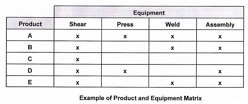
The matrix shows products that go through a series of common processes. A work cell could be formed to handle a particular flow. Another method is to create a Pareto chart of the various products. The product with the highest volume should be used for the model line.
The value stream for a product family may cross department boundaries in the company. This creates the potential for difficulties in coordinating an effective value stream project. Such problems call for the creation of a new position for a value stream manager. This manager must have the authority to make things happen and should report to the plant manager. It is recommended that a production person handle the job of value stream manager. This manager would monitor all aspects of the project. Being a hands-on person, the manager should on the floor on a regular basis.
2. Current State Map

A current state map of the process is developed. to facilitate a process analysis.
Basic tips on drawing a current state map include:
- Start with a quick orientation of process routes
- Personally follow the material and information flows
- Map the process with a backward flow, from shipping dock to the beginning
- Collect the data personally, do not trust the engineering standard times
- Map the whole stream
- Create a pencil drawing of the value stream
Some of the typical process data included are: cycle time (CT), changeover time (COT), uptime (UT), number of operators, pack size, working time (minus breaks, in seconds), WIP, and scrap rate. An analysis of the current status can provide the amount of lead and value-added time. in many situations teams take on the task of data collection. Both individuals and teams find it beneficial to develop a VSM data box in advance.
Value stream mapping definitions worth noting include:
- Value-added time (VAT) – The amount of time spent transforming the product, which the customer is willing to pay for.
- Lead time (LIT) – The time it takes one piece of product to move through all of the processes.
- Cycle time (CIT) – The time it takes a piece to complete an individual process.
- Reliability (REL) – Reliability of the process step. Some current state maps show this as uptime %.
3. Future State Map

A future value stream map, is an attempt to make the process lean. This involves creativity and teamwork by the value stream manager and the lean team to identify creative solutions. Everything the team knows about lean manufacturing principles is used to create the process of the future.
Questions to ask when developing a future state map are:
- What is the required takt time?
- Do manufactured items move directly to shipping?
- Are items sent to a finished goods supermarket for customer pull?
- Is continuous flow processing applicable?
- Where is the pacemaker process? (This process controls the tempo of the value stream.)
- Can the process be leveled?
- What is the increment of work to be released for kanban use?
- What process improvements can be used:. changeover, machine uptime, kaizen events, SMED, etc.?

Implementation Planning
The final step in the value stream mapping process is to develop an implementation plan for establishing the future state. This includes a step-by-step plan, measurable goals, and checkpoints to measure progress. A Gantt chart may be used to illustrate the implementation plan. Several factors determine the speed of the plan. These include available resources and funding. The plan could take months or years to complete, and even then, there may be a need to improve upon it in the future.
Some of the areas to create a value stream map
To effectively create a value stream map for your company’s manufacturing or business processes, you should focus on the following areas:
- The flow of information—from the receipt of a sales order or production data all the way through the engineering, production, control, purchasing, production, shipping, and accounting processes.
- Production activities, which are the physical tasks employees must perform to produce a product or deliver a service.
- Material flow, the physical movement of materials from receiving, through production, to the shipment or delivery of finished goods or services.
- Customer value, which is an aspect of a product or service for which a customer is willing to pay.(This is sometimes referred to as “value added.”)
- A push system, where materials are automatically moved from one operation to the next, whether or not they are needed.
- A pull system, where materials are moved from one operation to the next based on a request from the next operation.
- Any waste involved in your business or manufacturing processes.
- Takt time, which is the total available work time per day (or shift) divided by customer-demand requirements per day (or shift). Takt time sets the pace of production to match the rate of customer demand.
- Lead time, which is the time it takes to complete an activity from start to finish.
- You also need to become familiar with four types of icons:
- Production-flow icons
- Material-flow icons
- Information-flow icons
- Lean manufacturing icons


Steps in creating value stream map:
- All employees should map the value stream by themselves. Usually, each employee’s map will be different from all the others. Then, by comparing maps and working together to reach a consensus, your work team can develop the most accurate map of the value stream possible.
- Assemble paper, pencils, erasers, and a stopwatch for collecting data. Select a product or service to map. Conduct a quick tour of the value stream to view the end-to-end material and information flows, making sure that you have identified all the component flows. Don’t work from memory. Observe the value stream in action. Interview each team member on every shift, if applicable. Verify your observations against documented procedures, routings, job aids, and memoranda. Record exactly what you see without making any judgments. Don’t waste time debating the merits of an activity or its proper sequence; just record what is happening.
- Identify a representative customer of the product or service under review. Once you have identified a typical customer, gather data about typical order quantities, delivery frequencies, and number of product or service variations. This information will help you establish the takt time for the customer and the product.
- Begin mapping the value stream, starting with customer requirements and going through the major production activities. The result is a current-state map of the value stream. Begin mapping the value stream by drawing on Sticky Notes/cards, which can be easily rearranged while your team comes to a consensus, or use a pencil and eraser to draw and refine your map.
- Add production-flow, material-flow, information flow, and lean manufacturing icons to your value stream map. During data collection, show whether information is communicated in real time or in batches. If it is communicated in batches, show the size of the batches, how often they are sent, and the process delay. Identify every location where material is stored, sits idle, or is moved. If your company uses a kanban production control system, show the use of load-leveling boxes or individual kanban posts (mailboxes). Also show where the physical kanbans are used. Identify all non-value-added activities in all the production, material, and information flows.
- Create a lead-time chart at the bottom of your value stream map, showing the value-added and nonvalue- added production lead times.
- Review the map with all the employees who work in the value stream you have mapped to ensure you haven’t missed any activities or materials.
Using value stream map to make future improvements in organization
- Look at your takt time
- Your goal is to get your organization’s value stream to produce to the takt time. You can calculate the takt time that your production or business processes must meet by using the following formula:
takt time = available daily production time/required daily quantity of output(i.e., customer demand)
When the value stream produces ahead of the takt time, overproduction occurs; when it produces behind the takt time, under-production occurs. If your value stream is not producing to the takt time, investigate possible causes. What processes might be negatively affecting production? - Are you producing finished goods only to add them to inventory, or are your sales and operations activities integrated so that your production schedules are based on actual customer orders?
Remember, your goal is to have your value stream driven by customer orders. It is also beneficial to minimize inventory in the production channel. This frees up your capacity, and you will then be able to meet smaller-order quantities more frequently.
- Your goal is to get your organization’s value stream to produce to the takt time. You can calculate the takt time that your production or business processes must meet by using the following formula:
- Apply one-piece-flow principles
Does your value stream have large batch and process delays that add to your lead time? Such delays can occur in your production, material, or information flows. To eliminate batch and process delays, try applying one-piece-flow principles to your value stream. - Apply quick-changeover, error-proofing, and visual management techniques
- Can you use quick-changeover methods to reduce your setup costs and batch sizes? By reducing changeover times, your company will be able to run smaller batch sizes and free up production capacity. If being able to offer a mix of products and services is important, then quick changeover will reduce the number of operations you need to run every day, week, or month.
- Can you use error-proofing techniques to ensure that no product defects are being passed on to downstream operations? As batch sizes get smaller, the impact of product defects on your production schedules gets bigger. This is especially true if defects shut down operations.
- Have you conducted visual management activities, such as the 5 S’s, in your important operational areas? A well-organized and well-maintained workplace is key to ensuring that all employees perform their duties correctly and in a safe and proper manner, which ensures quality results.
- Apply work-standardization techniques
Are your work standards displayed at each workstation? Are they easy to understand? Do they reflect current practices? Proper work instructions ensure that the correct decisions and physical tasks are being performed to meet lead-time, waste reduction, and cost objectives. - Use load leveling
- Once you have applied one-piece-flow, quick changeover, error-proofing, visual management, and work-standardization techniques, try using load leveling in your value stream. This prevents overproduction and under-production. For example, if one of your customers needs ten blues, twenty greens, and thirty yellows per five day workweek, your objective is to build two blues, four greens, and six yellows each day. Then, if the customer decides to decrease or increase the order during the week, you can immediately respond by changing your production schedules to keep producing to the takt time.
- Check your build sequence. This can have a significant impact on your changeover times and product availability. Does your build sequence work well with your planned production volumes and mix? For example, it may be better to build two blues, then six yellows, and then four greens, rather than building four greens first. Eventually, you should develop a plan for every part of your build sequence that takes into account customer-service levels and production mix and volumes.
- Establish lean metrics
Establish metrics for your value stream to make sure that you are meeting lead-time, waste-reduction, and cost objectives. Use other tools to complement your value stream map You can obtain excellent insight into your organization’s current and future operational practices by using a value stream map in conjunction with flowcharts and a workflow diagram . Because the value stream map provides you with a “big picture” view of several interconnected activities, it is a good place to start. You can then further describe the details of specific work processes using flowcharting techniques. A workflow diagram is useful for gathering physical information, such as the distance between work operations and the movement of employees and materials. It is possible to record such information on a value stream map, but it is more easily viewed and understood when you include it on a workflow diagram.
If you need assistance or have any doubt and need to ask any question contact us at: preteshbiswas@gmail.com. You can also contribute to this discussion and we shall be very happy to publish them in this blog. Your comment and suggestion is also welcome.
Dear Preteshbiswas San,
Good morning & Thanks for your continued social activity of enlightening many Peoples.
Excellent Study materials… Keep Continuing your best service to the humanity.
Thanks & Best Regards,
M . Mani